Visual impairments make using ordinary products much more difficult. This article lists ways that products can be modified to be more inclusive of users with blindness, visual impairment, or colour blindness.
Globally, 39 million people are blind, and an additional 246 million experience moderate to severe visual impairment (WHO, 2021). These impairments severely affect navigation, safety, and daily—task performance. Studies show that 70% of individuals with visual impairments face falls annually, and many report challenges with spatial awareness and cognitive load. Adaptive design offers solutions that utilize sensory input, spatial predictability, and barrier-free layouts to address these challenges.
Designing accessible and independent living spaces for visually impaired individuals
Talking/audio features
- Ensure digital apps and websites are designed for screen readers for digital devices (i.e. images within webpages and digital designs need ‘alt text’ describing the image – text that is read aloud by screen readers when the image is encountered)
- Voice-activated devices
- Offer audio options, such as talking thermometers that provide a voice readout of temperature, or clocks that announces the time on button press
Tactile/braille elements
- Braille on appliance buttons
- Textural changes to communicate edges of surfaces – directing attention toward buttons or levers, or separating different parts of a product, or for identifying days of the week on medicine packaging
- Distinct shapes can be used to differentiate controls
- Use consistent button layouts across a product range
Improved legibility of text / symbols
- Big buttons or controls – enlarged, clearly labeled buttons
- Use high contrast colours – black on white rather than pale grey on white
- Simplify typography – avoid decorative styles
- Reduce colour combinations that cause difficulties for those with colour blindness (i.e. red and green) – simplifying colour schemes
- Allow users to adjust settings – zoom-in functionality – or ability to adjust font size and contrast on digital applications
- Avoid glare – choose matt surfaces that minimise reflections
Navigation aids
- Rails to help users safely walking across treacherous areas or busy public areas
- Strong contrast on stairs or to signal changes in surface level, identifying trip hazards
Opportunities for Product Modification
- Measuring cups and scales typically require reading small text or digital displays. Redesign could involve raised tactile numbers/braille, audio readouts, or high-contrast markings.
- Television remote controls often have buttons that are identical to touch with no logical layout for non-visual use. Could be redesigned with distinct button shapes, textures, or logical groupings.
- Wardrobes / closets to hang clothes provide no way to identify colors, patterns, or clothing types by touch. Students could design tactile tagging systems, organization aids, or texture-based identification methods.
- Pill / medication organisers are critical for health but typically rely on visual identification of pills and compartments. Opportunities include tactile day/time indicators, audio reminders, or secure tactile marking systems.
- Shampoo/conditioner bottles often have identical shapes make it impossible to distinguish between products by touch. Could be redesigned with distinct shapes, textures, and larger font to make identification easier.
- Door handles and locks often provide no tactile feedback about lock status or key orientation. Could be modified with tactile indicators for locked/unlocked status and key positioning guides.
- Exercise equipment displays on treadmills and bikes often use complex visual displays for settings and feedback. Could be enhanced with audio feedback, tactile controls, or simplified navigation systems.
Sample examination questions (AS Design & Technology)


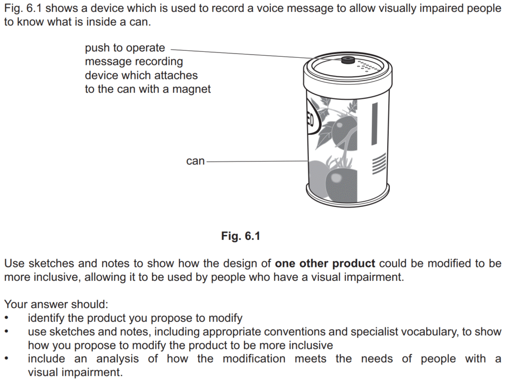
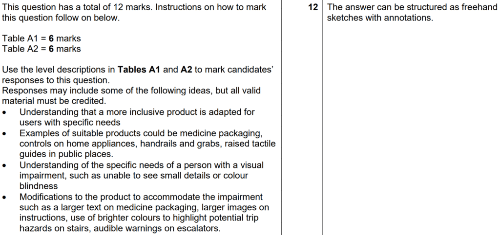
Examiner comment: Candidates were asked to use sketches and notes to show how the design of one other product could be modified to be more inclusive, allowing it to be used by people who have a visual impairment. Modifications included larger text on medicine packaging, larger images on instructions, the use of brighter colours to highlight potential trip hazards, audible warnings on escalators and braille numbers and letters on a variety of products including remote controls and mobile phones. The quality of sketches and notes were usually of a very high standard and nearly always sufficient to communicate the modification. A small number of candidates did not show how the design of another product could be modified for use by people with a visual impairment and simply described the example given in the question.
Many candidates demonstrated a good understanding of the specific needs of a person with a visual impairment, such as being unable to see small details or colour blindness. For many candidates the strength of their response was in showing how they intended to modify a specific product for use by a person with a visual impairment, rather than analysing how the modification that they had proposed would meet the needs of people with a visual impairment.
